<
Rio Nepal New Packaging Launch – CG Nepal - ads! digital
Success Story
Rio Nepal New Packaging Launch – CG Nepal
To introduce a refreshed identity for one of Nepal’s most recognizable fruit drink brands, Rio, Chaudhary Group launched a campaign unveiling the brand’s new packaging design.
The campaign aimed to highlight the modernized look of Rio while reinforcing the brand’s fun, energetic personality. Through a mix of digital promotions, social media engagement, and retail visibility, the new packaging was introduced to consumers across Nepal.
By combining strong visuals with engaging content, the campaign successfully created awareness around Rio’s refreshed appearance while maintaining the familiarity and trust the brand has built over the years.
Their Story
A Fresh Look for a Familiar Favorite
For years, Rio has been a go-to refreshment for Nepali consumers, known for its fruity flavors and vibrant brand personality.
However, as consumer preferences evolve and retail shelves become more competitive, brands must continue to reinvent themselves to stay relevant.
To keep the brand fresh and appealing to a younger audience, Chaudhary Group introduced new packaging for Rio, designed to reflect a more modern, bold, and eye-catching visual identity.
The new design enhanced shelf appeal while maintaining the brand’s recognizable colors and playful energy.
Through the launch campaign, Rio invited consumers to rediscover the drink they already loved — now presented in a fresh and contemporary look.
Their Goal
Reinforcing Brand Relevance Through a Packaging Refresh
The campaign wasn’t built merely to announce a packaging change; it was crafted to tighten Rio’s grip on its audience, to remind people why they reached for it in the first place. The mission was clear: introduce the refreshed design across Nepal, spark curiosity, and turn heads in crowded shelves and endless scrolls. But here’s the twist—it had to evolve without losing its soul. Loyal customers needed reassurance, not confusion, while a new generation had to feel like Rio finally spoke their language. The visuals got sharper, younger, louder—but the promise stayed untouched.
Because at the end of the day, the message hit simple and hard: the outside may have changed, but that same familiar taste, that same little hit of joy… still hits exactly the same.
Their Solution
A Visual Campaign Built Around the New Identity
This wasn’t just a rollout—it was a reveal, the kind that feels familiar at first glance… then hits different the second time.
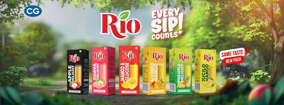
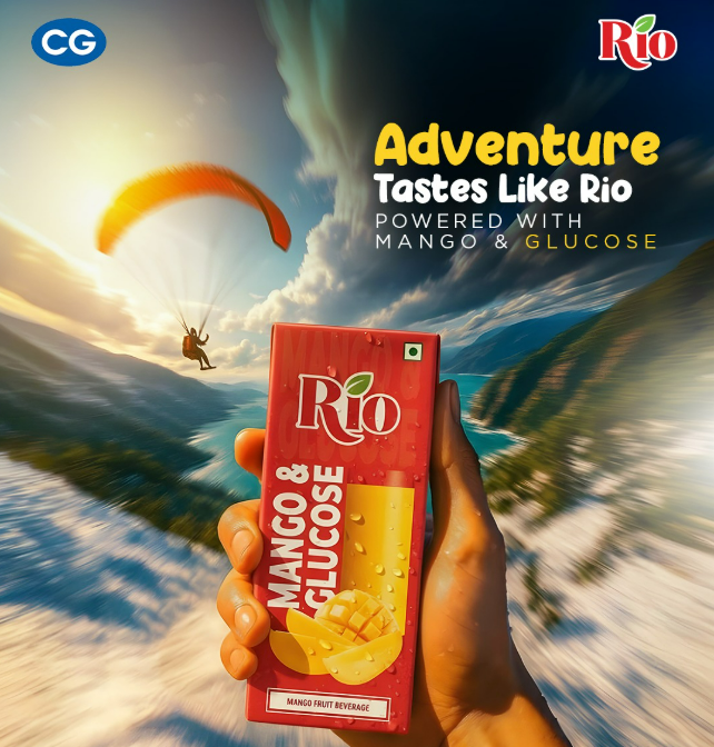
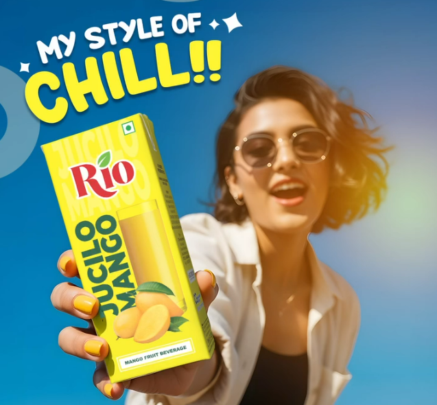
To introduce the refreshed packaging, CG built the campaign on visual storytelling and unmistakable brand recognition. No heavy explanations, no overcomplication—just strong, striking visuals that did the talking. It began with bold packaging reveal content, crafted to stop the scroll and hold attention for that extra second. The new Rio design came alive through vibrant colors, sharper contrasts, and a cleaner, more modern layout—built not just to sit on shelves, but to stand out and be remembered.
Then the digital wave followed—steady, intentional, and everywhere. Across Facebook and Instagram, the audience was taken through a visual journey. Side-by-side comparisons tapped into nostalgia, reminding people of what Rio used to look like, while close-up shots highlighted the details of what it had become. It created that subtle tension—“this feels new… but I know this.” And that’s where the connection deepened.
But a campaign like this can’t live only on screens. The real test? The shelves. And CG made sure the transition didn’t miss a beat. Retail outlets across Nepal were aligned with the rollout, so when customers walked into stores, the new packaging wasn’t a surprise—it was a confirmation. What they saw online, they could instantly recognize in their hands. No second-guessing, no hesitation.
Layered on top of this was a stream of engaging visual content—short, punchy, and full of energy. Quick cuts, bright frames, everyday moments. The kind of content that doesn’t try too hard, because Rio never had to. It reinforced a simple idea: this is still your go-to refreshment, your small break in a busy day, your little joy.
Because in the end, the campaign didn’t just say “we’ve changed.” It said, “we’ve grown—but we’re still yours.”
Packaging Reveal
Introducing the refreshed Rio design through visually striking content.
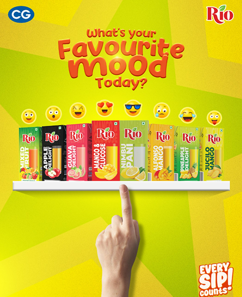
Social Media Campaign
Promoting the new packaging across digital platforms to maximize reach.
Retail Activation
Ensuring strong visibility of the updated packaging in stores.
Their Success
A Refresh that Reinvigorated the Brand
The new packaging campaign successfully reintroduced Rio to the market with a modern visual identity that resonated with both loyal consumers and new audiences.
The refreshed look helped the product stand out on retail shelves while generating curiosity and engagement across social media.
Key campaign highlights included:
Increased consumer awareness about the new Rio packaging design • Strong engagement on social media posts featuring the product refresh • Positive response from retail partners and customers • Enhanced shelf visibility through the updated design • Reinforced brand relevance among younger consumers
The campaign demonstrated that a thoughtful packaging refresh, combined with strategic promotion, can revitalize a well-loved brand while preserving the identity consumers trust.
Through the Rio New Packaging Launch, Chaudhary Group successfully gave the brand a fresh face while keeping the same refreshing spirit that Nepali consumers have enjoyed for years.